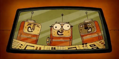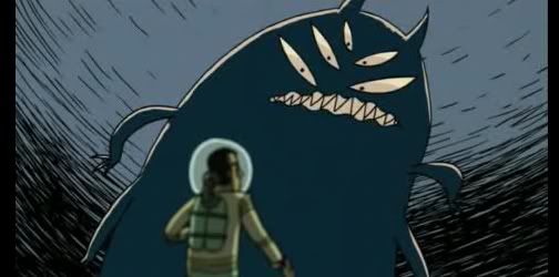

 The first 2 part episode; it ended up feeling a lot busier than I wanted, but I'm really happy with how dramatic it is. I got a little lazy and re-purposed this for part 2 as well.
 Ran out of ideas on this one... sometimes neither the episodes content or the play-on-words title offer any kind of inspiration.
 I think Harvest Day looked much better as a thumbnail, I like how the fences and tress turned out, but the rolling hills look awfully barren now and I don't like how crowded the text is...oh well.
 Lots of drama here, unlike the episode which was actually very silly. The final text colour was bright blue, but I always liked the yellow.
 And finally, another 2 parter cop-out...and of course, drama. If you've ever watched this show, you'll see that it isn't nearly as dramatic or exciting as these drawings might suggest... I like to think it adds to the humor.
Thanks for stopping by.
-S


