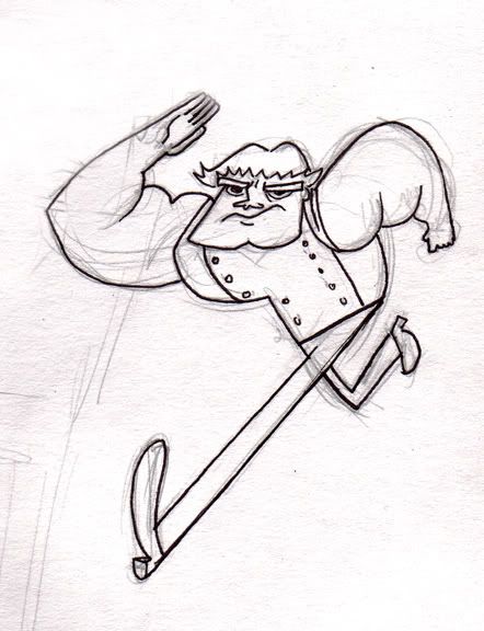
Friday, September 25, 2009

Mixed Bag

I recently got a chance to design the logo for our local Weightlifting club, I've never done any logo design but I like how this turned out.
I think every artist at one point or another gets asked by a friend/family member/co-worker to design a tattoo... this is also a first, and I'm not sure I would want this stamped on my body, but it was well received and having agreed to this an embarrassingly long time ago, I'm just happy to have completed it.

Thursday, September 03, 2009

Jimmy artwork


Toward the end of Jimmy Two-shoes I was asked to create a series of promotional images; I'd never done any kind of polished artwork like this before so it ended up being a little crazy, but I had a lot of fun with them and learned tons!

Mostly I was given thumbnails to clean up/elaborate on, but this is one that I came up with the idea for and I'm still pretty happy with how it turned out.

Sunday, May 17, 2009

Jump cycle

Wednesday, May 13, 2009

Jump rope, without the rope

Friday, May 08, 2009

Curious

The result of a drawing jam based on a random description generated from This website. Very fun, definitely have to do this again soon!

Sunday, April 26, 2009

Animation!


As it turns out, animating a guy jumping rope is pretty complicated... I decided to take a break and start with something a little simpler. It took my WAY longer than it should have, but now it's done!

Thanks to Meg for teaching me her super-awesome rendering tricks.

Sunday, February 08, 2009

Jump Rope


With work on Jimmy Two-shoes wrapping up, I'm finally taking some time to do a little animation!

I purchased a series of awesome tutorials by Jason Ryan a while back, but never got a chance to really dig into them. This is my first shot at a guy jumping rope; after slogging my way through all of Flipbook's little quirks, and remembering how to actually animate with drawings, I think it looks pretty decent. It's not fully inbetweened and I'm not really happy with the movement, but instead of redoing it I think I'll take it into 3D and try to make the next "assignment" better. Any feedback is much appreciated!

-Simon

Saturday, January 24, 2009

3D stuff


Just a quick ball test, soon to be improved upon.

Sunday, November 23, 2008

Title Cards continued

The second half


The first 2 part episode; it ended up feeling a lot busier than I wanted, but I'm really happy with how dramatic it is. I got a little lazy and re-purposed this for part 2 as well.


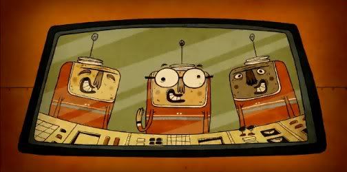
Ran out of ideas on this one... sometimes neither the episodes content or the play-on-words title offer any kind of inspiration.

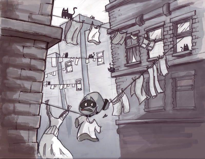
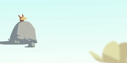
I think Harvest Day looked much better as a thumbnail, I like how the fences and tress turned out, but the rolling hills look awfully barren now and I don't like how crowded the text is...oh well.


Lots of drama here, unlike the episode which was actually very silly. The final text colour was bright blue, but I always liked the yellow.

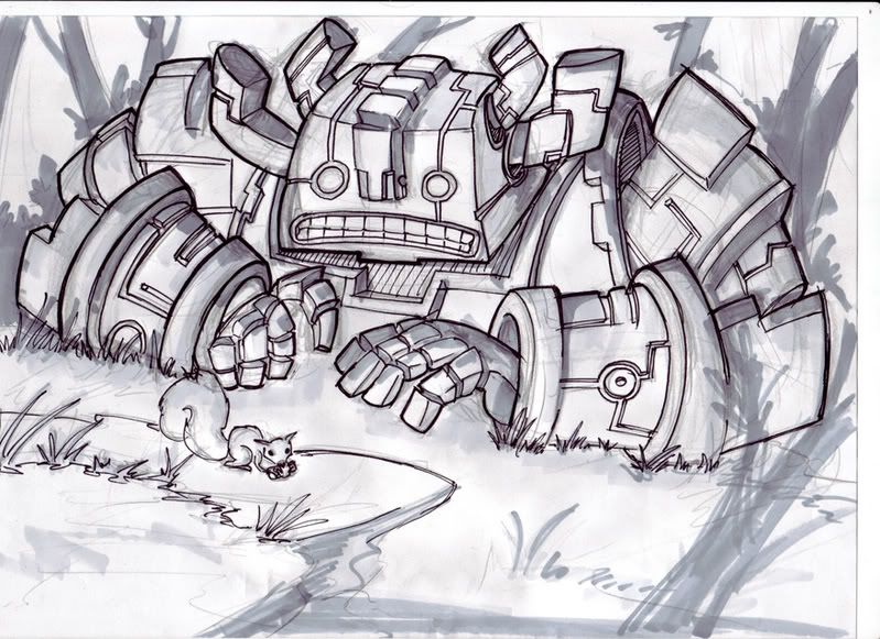
Mmm dramatic, I like how the forest turned out.


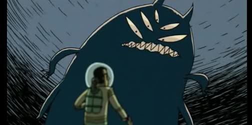
And finally, another 2 parter cop-out...and of course, drama. If you've ever watched this show, you'll see that it isn't nearly as dramatic or exciting as these drawings might suggest... I like to think it adds to the humor.

Thanks for stopping by.
-S

Title Cards

These are some title cards I did for World of Quest last year. This was the first time I'd done any finished/coloured artwork like this, I learned a lot!

They aren't all winners, but I had a great time making them.


This one is the first one that came together really easily, I'm pretty happy with the simplicity:effectiveness ratio.


This one was a struggle. After 5 revisions it looks almost nothing like the original (which was nothing special either) , I find it still feels a bit slapped together.


This one is probably my favorite of the bunch. I was really pushing to keep the composition very graphic and clean. I started this with a black and white version to solidly block in the silhouettes (previously I had only done sketches).

to be continued...

Sunday, October 19, 2008

Space Adventurer and a Pug


Title says it all. The grumpy pug was inspired by Meaghan's drawings

Saturday, March 29, 2008

Andy - Roo

Oh no, Andrew's a cartoon! Whatever shall we do??

Wednesday, March 19, 2008

If Beavers were as domesticateable as hamsters...


... We'd be in for a treat.

Sunday, December 02, 2007

Large Knight, and fat Bird-dragon


Saturday, August 04, 2007

Pieman!

This is my first succesful drawing of a character I'm designing for this site:

http://www.entervoid.com/

He's a masterful baker/fighter with a score to settle. With all aspects and ingredients of pies as his arsenal he uses his magical pie-fu abilities in his quest to avenge his family and restore honour to a long line of pie-chefs. His tentative name is Burly Pieman.

Who knows if I'll go beyond designing him and actually do some fights... but for the time being I'm having fun!

Sunday, June 10, 2007

Another girl, along the same theme

Friday, June 08, 2007

Girly sketches

Just some sketches I did, trying to get some ideas out.

Sunday, May 13, 2007

Oldmanface

Thursday, May 10, 2007

Croc!

Wednesday, May 09, 2007

Sharpie!


I did some sharpie sketches this morning, just trying to loosen up and "Break out" of my habits a bit. I love how much markers force you to commit to your lines, great for just getting ideas out without too much fuss.

I tried some Prismacolors on 3 of my favorites from the batch. I've got a long way to go, but I had a lot of fun.

Saturday, April 14, 2007

Snoozin

Saturday, March 24, 2007

Racoon Concept

My attempt at concept art for a story that may eventually see the light of day.

Sunday, October 01, 2006

Harold tries again...

Tuesday, September 26, 2006

Robo takes a walk in the woods...

Sunday, September 24, 2006

5

Munk TV

First character done with prismacolors; not bad I think. I still can't get over how terrifying it is putting down my first pass of markers, I could've sworn that the drawing was ruined about halfway through.

Wednesday, September 20, 2006

2

3

1